Orchids: Silk versus Real

Orchids 3

How do you feel about silk plants?  Are you a purist who will only allow fresh flowers in your home?  Do you frequent the silk flower section at Michaels, Hobby Lobby or Dollar Tree?  Or, are you perhaps somewhere in between?  I place myself in the latter category and in just a minute,  I will show you why.  Before I do, I wanted to show you an article that I found from Architectural Magazine.  Let me quote just a little,

“Mention fake plants to most people and the response will be outrage—artificial flora is a soulless simulacrum, they moan, a horticultural travesty, and just plain tacky. John Updike, the novelist, called them an “obscene mockery”.  Yet no less a design authority than Mario Buatta swears by potted silk orchids, saying they look like the real thing and are godsend for clients who travel so frequently they can’t keep real ones alive.”

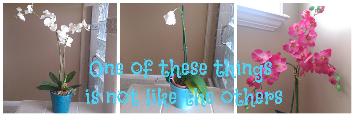
I couldn’t agree more.  Case in point?  This little natural beauty:

IMAG00236

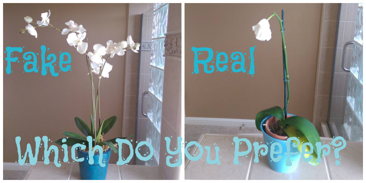
Stunning, isn’t it?  Ahem.  Actually it looked great for about 2 months I would say.  I made sure that I didn’t water it too much.  I made sure that no water ever touched the leaves.  I made sure that it wasn’t in direct sunlight, yadda, yadda, yadda.  I was quite proud of my little orchid and of my apparent green thumb.  But, like all good things, the blooms came to an end.  I was left with just that one little bloom.  After some research I learned that if I continued to care for the “plant” with just the right amount of watering, right placement, etc. it could bloom again!  In about a year.  Hmmmph.   The phrase, “Ain’t nobody got time for that!” comes to mind.   Into the trash it went.

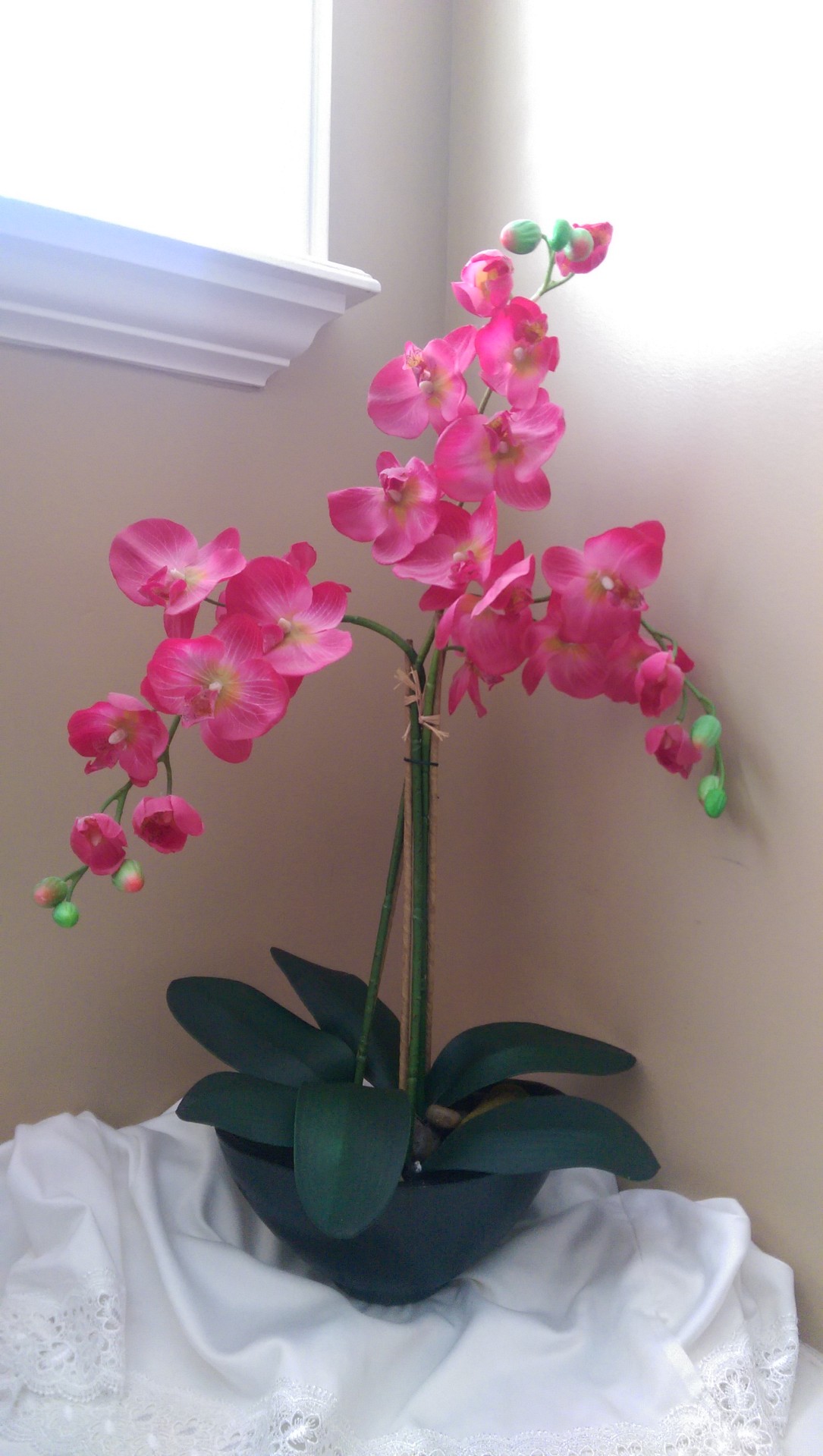
And check out the orchid that I have had for almost 10 years:

IMAG00235

It is still as beautiful as the day that I bought it.  The only upkeep is a light leaf-dusting every couple of months.  The only thing that I have changed is the pot color.  Teal spray paint with a bit of Minwax Ebony stain to age it.

Here is my mom’s fake orchid:

IMAG00379

It’s a beauty, isn’t it?  It has been looking this fabulous for 3 or 4 years now.  When my sister gave her the orchid, she started messing with the branches to reshape them, and Mom finally said, “I’m afraid that you are going to break it.”  My sister then answered, “Mom, you do know that this is fake, right?”  She didn’t.

Which makes my point perfectly.  Is it really such a travesty to have fake plants, in this case orchids, if they can forever be in bloom, looking vivid and fabulous?  My answer?  An emphatic “No!”  Of course I do still love real flowers, as well.   I’m pretty well-rounded that way.

Orchids Real Fake

So, what do you think?  Are silk plants/flowers allowed in YOUR home?


********* Linking up to these awesome parties!*********


DIY: “Special Times” Perpetual Calendar

SpecialTimes

Have you seen those family birthday calendars out there in the internet world?  They are a cool way to keep track of the birthdays in your family, for sure.  Most of the ones that I have seen are a long wooden sign that says, “Birthdays” or “Family” or “Family Birthdays” or something along those lines.  Across the bottom of the sign they list each of the twelve months or an initial to represent each month.  Then, under each month there are squares, hearts, circles all chained together; each one has a name and a number to represent a family member’s birthday.  Have you seen them?  Do you have any idea what I am talking about?  If not, Google or Bing “Family Birthday Calendar” right now.  You will be bombarded with all kinds of versions of what I just described.  See?   I would show you some pictures, but I don’t want to break any copyright laws.  End up in prison, or worse.

Well, a while back I had some requests from some ladies at church to make one of these birthday calendars for an upcoming “Super Saturday” craft making day.  I looked and looked and hemmed and hawed as I tried to find the perfect calendar to copy.  At the back of my mind were questions like, “What about small families?” and “What if no one has a birthday in Feb., or July, or September…the whole thing will look out-of-whack” and “What if a new child or grandbaby is born?  People will constantly be seeking me out to cut out more hearts or squares or circles.”.  I also got thinking about the anniversaries and other holidays that we look forward that aren’t birthdays.   This is what I came up with instead:

IMAG00320

Basically I painted a purchased wood plaque, painted it black and cut out white vinyl on my Roland Dr. Stika cutter.  The black with white lettering kind of gives a chalkboard-y look, don’t you think?

The hook is just a cup hook that I spray painted black.

IMAG00330

When doing this in bulk, just stick the screw ends into some cardboard to make them stand up and spray away.  Then screw it in your painted board.  Easy enough!

For my tags, I just hand traced and cut them out with scissors, but you can use any shape that you want…rectangles…hearts…circles…whatever.  Make sure that there is a hole to slip over the hook.  For a clean look, only use one shape and have enough for each birthday, anniversary, holiday that you want to remember to celebrate.  In fact, have extras for newbies that join the family.  I handwrote on my tags and added border details, but when I made one of these perpetual calendars for my parents (who have 10 kids plus their spouses and grandchildren…), I typed, printed and then hand cut out each tag.  Made it look more professional.

So, the way that these calendars work is that you put all of the tags in chronological order with the next special day’s tag on top and place the stack on the hook.  When the special day on the top is over, pull the pile off of the hook, put the top tag on the bottom of the pile and put them all back on the hook.  That way you can see at a glance when the next celebration is.  Cool, right?  (If two or more people share a special day, put both events on one tag.)

As I have mentioned before, I am losing the beige and going gray in my home and I decided to lighten my calendar up.  First I mixed up a gray-blue shade of paint and painted a couple of coats over the black.  While the paint was still tacky I distressed a bit to reveal the black layer below.  I like to use a damp paper towel and/or my thumbnail to gently rub and  scrape away bits of paint.

Just for fun, I added a stenciled detail:

I cut out some new vinyl using the LimaBean font, slapped it on and replaced the cup screw.  I think that I like it.

So, which look do you like better?

Next celebration?  Mother’s Day!  Have a happy one!


********* Linking up to these awesome parties!*********

DIY Decorative Mirror Frame


Have you every used Gallery Glass products that help create stained glass looks?  I love the stuff!  My favorite is Crystal Clear (as if clear could be called a color):

IMAG00266

This is what it looks like.  My sister-in-law knows that I love this product and got me like 10 bottles of it when she saw it clearanced out.  Thanks, Kinna!!!  Now I can come up with all kinds of projects to make.  Trust me, I’ve got ideas!  Oh, and lest you think that Gallery Glass sponsors me…nah.  I’m not that cool.  I just like this stuff!

So, a couple of months ago I picked up a square framed mirror at the dollar store.  I bought it with absolutely no idea what I was going to do with it.  I like square stuff, remember?  Today I was doing some organizing and came across my G.G. stash (thanks again, Kinna!) and immediately formed an idea of what to do with the square framed mirror.  Want a sneak peak?

MirrorArt7

Question… have you ever tried to take a picture of a mirror?  Not that easy, let me tell you.  Just so you know!

So, let me walk you through the process from dollar store to finished art.  Ready?  Let’s go!

First thing, I cut up a 4×4 piece of sticker paper and placed it smack dab in the middle of the frame.  You could just use tape if you want.  You might as well know that I did this project twice.  First, using the tip of the bottle, I just made big squiggles:

It was ok, but not great, so I just scraped it off and started over again.  No tears, now worries.  Next try, I just smeared a layer of G.G. over the whole mirror.  I didn’t really take any pics because I used my fingers to smear the stuff around.  Messy.  I used Q-tips to make my design.  Basically, I just wiped vertical “stripes” and then horizontal.  I truly wasn’t going for perfection, more of a playful look.  Really, the sky is the limit when comes to the textured looks you can create with this product.

IMAG00273

Important: once the product has dried, and before trying to remove the paper/tape from the center of the frame, make sure that you score around the paper with a razor so your awesome design doesn’t come up with it.

IMAG00275

Honestly, this project would have been easier if I would have removed the mirror from the frame.  I made quite a mess near the frame, so I made it part of the design and just wiped the area closest to the frame clean.  Yeah, I used a bunch of Q-tips and this is what it looked like once it dried:

MirrorArt2

Well, it was mostly dry at this point.  See what I mean about taking pictures of mirrors?  I actually like this shot because it shows the effect pretty well.  Not perfect, but that is just fine with me.  I wish you could see it in person.

Don’t you just love this quote?   It is by Gordon B. Hinkley and I adore it.  I just printed it up on aqua cardstock, cut it 4×4 inches, sprayed some spray adhesive on the back side and stuck it right in the middle.  Go ahead and print it up for yourself, if you want to.  Look closely at the cardstock.  Do you like the spotted bits?  Kind of goes with the distressed font (Attic), right?

MirrorArt6

The spots were a happy accident. I tried to distress the frame a bit with sandpaper, but it didn’t really show.  BUT, it got bits of black dust on the paper and I decided I liked it so I purposely added more, smashing it on with a paper towel.

A-ny-way… it is done and here it is!

MirrorArt4

Again, the little white bits are mostly dry.  Ain’t nobody got time to wait!  Oh, yeah.  I added a satin flower that I made a while back and I like the way it looks.

One more look?  O.K., fine.

MirrorArt5

Makes you want to run out to the craft store RIGHT NOW to get some Crystal Clear Gallery Glass Window Color, doesn’t it?  Go! I want to see what you create!


********* Linking up to these awesome parties!*********


2 Minute DIY: From Tank Top to Framed Art

Framed Flag Art

Got an extra 2 minutes?  It’s time for some lightning speed DIY!

We have all heard it said that sometimes you’ve got to think outside the box.  True in so many ways, including home décor.  Case in point, this black tank top with a cool metallic gold American Flag detail:

0430131613

I added the frame in this pic as a clue to my “out of the box” idea.  Are you thinking what I’m thinking?  Of course you are, you smartie!

This tank was a child’s size that I got at my local thrift store in one of those “as much as you can shove in a bag for $5” sales.  I love those.   I can shove a LOT in a bag.  I have seen similar tank tops in my days of perusing thrift stores and garage sales.  My guess is that if you frequent these cheapo shopping venues, you are sure to run across frame-worthy art, as well.

You will notice that my frame in the above pic is black.  I just applied a couple of coats of off-white paint and scraped off bits when it was still a bit damp to reveal the black beneath.  FYI: I am not going to count that in my 2 minute (see my title) time frame.  My blog, my rules!  My thought is that you may already have a frame that you love that you don’t need to paint.  2 minutes:  Ready?  Begin!

Take apart the frame and use the glass (carefully) as your pattern to center your tshirt art.  Trace around it with a pencil, pen, whatever (a white colored pencil works great on black), then cut it out.  At this point you can just discard the glass, or keep it.  Your choice.  I tossed mine.  Now, just adhere the fabric to the cardboard back of the frame, making sure that it looks centered in the frame.  I used spray adhesive, but you can tape the edges down or in all honesty, you can just center it on the cardboard backing,

IMAG00229

…then stick it in the frame.  Voila!

IMAG00228


Makes me feel patriotic, just looking at it!  So, what are YOU going to frame as art?


**********Linking up to these awesome parties!**********

Tips&Tricks-LP-FEATURED


Witty Hoots

Thanks, to Brenna from Life After Laundry for picking this project as her favorite for Tips & Tricks week 10!  Another big “Thanks!” goes to Nemcsok Farms and Witty Hoots for picking this project/post as a Frugal Family Linky favorite!

Pastel Tissue Paper Spring Sign

Has Spring sprung where you live?  It has here and I love it!  The trees all blossomed a few weeks ago and flowers are coming out and everything is SO green.

IMAG00128 (2)

The phrase, “A breath of spring” certainly comes to mind.  I wanted to make a little something today to celebrate spring.  I knew that I wanted to make a sign of some sort with a length of 1×6 pine that I had in my garage.  I originally thought that I would make an Easter sign of some sort, but Easter will be here and gone before we know it.  I wanted something that can stay out for a couple of months or so and this is what I came up with:

IMAG00125 (2)

I love this phrase.  To me, it means that where you are right now in location and life circumstances is where you are planted.  You might be thrilled with where you are planted like a sunflower planted in good soil with ample water and full sun.  Yep, it is easy to bloom well in those conditions.  Maybe right now you are planted in not so perfect circumstances.   Bloom where you are planted means that even if your part of the world right now is weed infested with poor soil and very little sun, do your best to bloom anyway.  Basically, think positive, be happy, take life as it comes and pull out those weeds if you can.  If you can’t, then you be the best bloom you can be to brighten up your little spot in the garden.

Of course I could have whipped out a can of paint as I usually do when making similar signs, but this time I decided to try something new.  Want to see what I used instead of paint?

IMAG00120 (2)

Tissue paper!  I love the mint green that came with this pastel tissue paper set that I got at little old Dollar Tree.  The steps were simple:

  1. Crumple up the tissue paper to get it all wrinkly, then semi-flatten it back out
  2. Using a regular paint brush, paint a layer of decoupage medium on the bare wood, top and sides.  Another option would be to paint a base color similar to your choice of tissue color so you don’t have to do as many layers.
  3. While the decoupage medium is still wet, lay a sheet of paper slightly larger on all sides so you can wrap it around the edges.  As you lay it down, encourage wrinkles but attach it securely.
  4. Immediately (meaning that the layer below is still wet) brush decoupage medium on top of the tissue paper layer.  Apply to all sides (except the back).  On each corner edge you will have an excess of tissue…just tear it off and lay the remaining down with the decoupage medium.  You won’t even be able to notice it.
  5. Wait until the layers are dry before adding another layer.  My bottle says to wait 15-20 minutes.  I broke all rules and used my hair dryer to speed up the process and it worked just fine.  I’m such a rebel.
  6. Add as many layers as you want.  I added 3, but if I would have painted the board first, I would have just added one, maybe two.  Maybe next time I will paint with one color and tissue with another just for fun.  Maybe white with one layer of pink tissue on top for a sheer color effect.
  7. If you get any tears, that is okay.  Just tear a piece of tissue (straight edges will show up more than torn) and decoupage right over it.
  8. If you want the back to look nice, decoupage it as well once the front has completely dried.

IMAG00123 (2)

Really, the process is super easy and adds a different look.  For added effect, rub a little stain or dark wax on to accentuate the texture.  Hmmm…maybe this Fall I will try that.

I cut out the vinyl lettering with my Roland Stika vinyl cutter, but you could easily just print this Bloom pdf out (the font is Café Rojo) on paper (maybe with a cute print) and decoupage it right on your sign, leaving some space so you can see the your wrinkled tissue border around it.  (Do a test run with this method…some printer inks smear with the decoupage medium.  If yours does, I have heard that if you spray your printed page with hair spray, it will fix the problem.)

So, there you have it.  Simple, yet profound at the same time.

IMAG00126 (2)


IMAG00124 (2)

Unfortunately the pictures don’t really show the fun texture, but I really like the effect.  Try it for yourself and let me know what you think!   Now, go BLOOM!


(This project was featured as one of 6 Spring-Inspired Projects at the Do Tell Tuesday Link Party! Thanks Lisa, Diane, Cassie and Tori!)